
Accessibility
A good website works for everyone.
Accessibility is the practice of building websites that people with a wide range of abilities and circumstances can actually use — and it routinely makes a site better for everyone, not just people with disabilities.
Beginner Explanation
Accessibility is not a niche concern: it includes people who are blind or have low vision, people who are deaf or hard of hearing, people with motor impairments who can’t use a mouse, and people with cognitive disabilities that make dense or poorly structured content difficult to process — and improvements in this area routinely help everyone, including someone temporarily using a phone one-handed or browsing in bright sunlight. Readable text means sufficient font size (generally at least 16px for body text) and adequate line spacing. Good contrast ensures text is genuinely legible against its background.
Keyboard navigation ensures every interactive element can be reached and activated using only a keyboard, without a mouse at all — this is exactly why Chapter 2 insisted on real <button> and <a> elements instead of styled <div>s, since native HTML elements come with keyboard behavior built in automatically. Alt text, from Chapter 2 and revisited in Chapter 12, is what allows a screen reader to describe an image aloud to a visually impaired user. Form labels connect a text label to its corresponding input field using the HTML <label> element — placeholder text alone is a common and easily fixed accessibility failure, since it disappears the moment a user starts typing.
The current, stable standard most professional accessibility work is measured against is WCAG 2.2 at Level AA, which is also the specific standard referenced by major accessibility laws internationally. Beyond legal compliance, there’s a direct commercial reality worth remembering: an inaccessible website actively excludes real potential customers. Most accessibility work isn’t extra effort bolted onto a website — it’s simply the result of doing semantic HTML (Chapter 2) and thoughtful design (Chapter 3) correctly and consistently in the first place.
Real Business Examples
Real buttons instead of clickable divs
A "Book Now" button built as a real <button> can be reached and activated with just a keyboard — a styled <div> pretending to be a button usually can’t, without extra manual work.
Alt text that actually describes the photo
A gallery photo captioned "before-and-after carpet cleaning in a Pretoria lounge" tells a screen-reader user exactly what’s shown — "image1.jpg" tells them nothing.
Labels, not just placeholders
A contact form where "Phone Number" is a real, connected <label> — not just grey placeholder text that vanishes the moment someone starts typing.
Visual Diagram
Four pillars of an accessible page
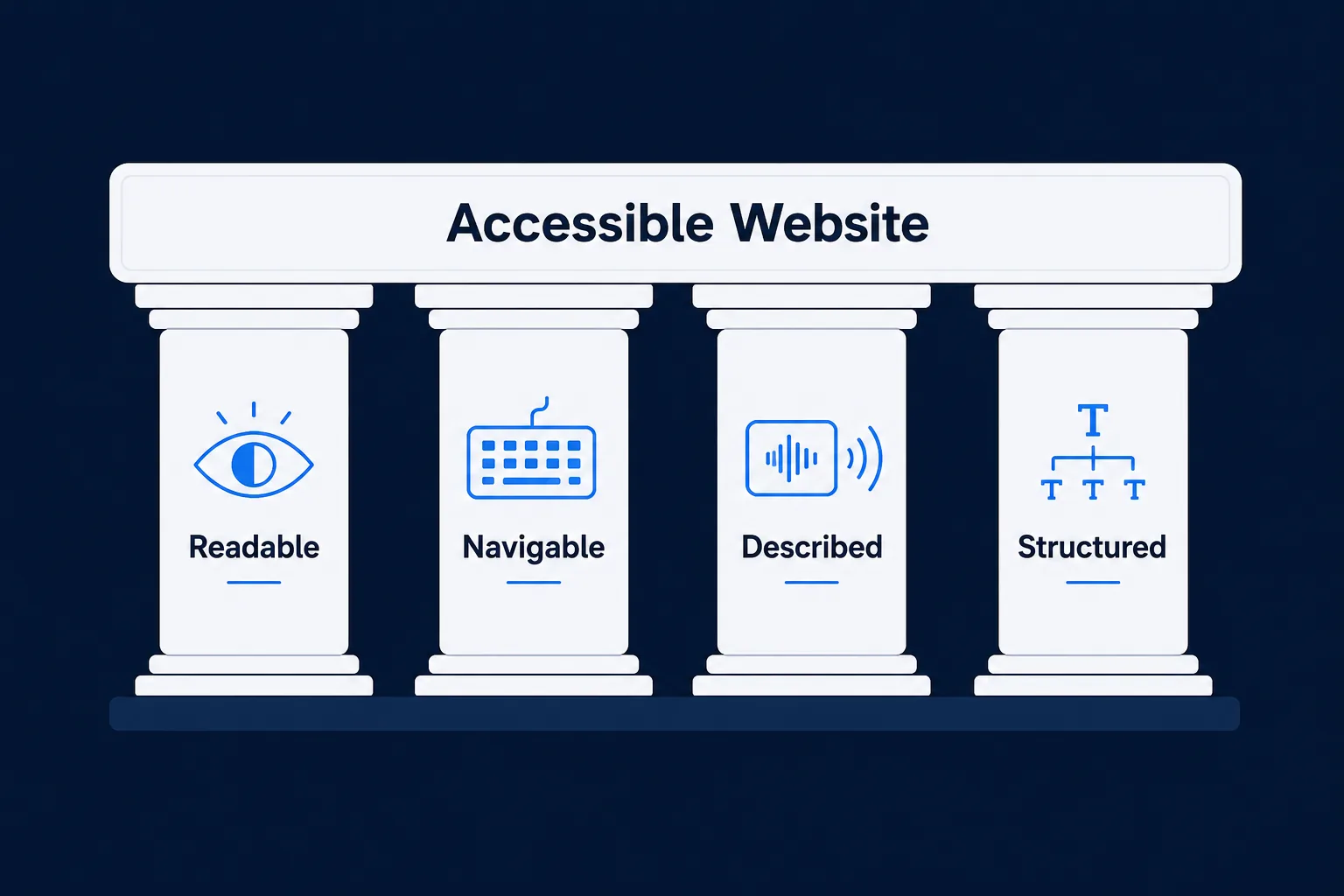
- Readable — sufficient font size, good contrast, sensible line spacing
- Navigable by keyboard — every link, button, and field reachable with Tab, Enter, Space
- Described for screen readers — meaningful alt text and connected form labels
- Structured clearly — logical heading order and semantic landmarks (Chapter 2)
Common Mistakes
- Using light grey text on a white background because it looks elegant, without checking it against real contrast-ratio guidelines.
- Building custom interactive elements from styled <div>s without manually rebuilding the keyboard behavior native elements get for free.
- Relying on placeholder text instead of a real, connected <label> for form fields.
- Treating accessibility as an optional layer added at the very end, if there’s time left, instead of inseparable from good HTML and design from the first line of code.
Tools to Use
WAVE / axe DevTools
Free browser extensions that scan any page for accessibility issues automatically.
Contrast checkers
Verify text and background colour combinations meet WCAG 2.2 AA contrast ratios.
Screen readers (VoiceOver, NVDA)
Test how a page actually sounds and navigates for a real assistive-technology user.
Keyboard-only testing
The simplest, free accessibility test available — just unplug the mouse.
Key Takeaways
- WCAG 2.2 Level AA is the current, practical standard for professional accessibility work.
- Real <button> and <a> elements provide free, built-in keyboard accessibility that custom-built substitutes usually lack.
- Every form field needs a real, connected <label> — placeholder text is not an adequate substitute.
- Most accessibility comes from doing semantic HTML and good design correctly, not from a separate, bolted-on effort.
Practical Exercises
- Unplug your mouse (or simply avoid using it) and try navigating a practice website using only the Tab, Enter, and Space keys. Note every place you get stuck, can’t tell what’s focused, or can’t activate — each one is a real accessibility issue to fix.
Want "Accessibility" done for you, not just explained?
We build fast, mobile-first websites for South African local businesses — putting everything in this chapter into practice, professionally.