
Forms and User Input
Forms turn visitors into leads.
A beautifully designed website that never asks anything of its visitors will rarely generate business on its own. This phase is about designing forms that people actually finish, not just forms that technically function.
Beginner Explanation
Contact forms are the simplest and most universal type — typically name, email, and a message field. Their job is to open a conversation, so they should stay short; every additional field measurably reduces the percentage of visitors who complete it. Quote forms collect enough detail for a business to prepare a meaningful response, often including service type, rough scope, and location — the tension here is real: more fields mean better-qualified leads, but also more abandonment.
Booking forms handle scheduling directly, often requiring integration with a calendar system or backend logic (Chapter 9) to check availability and prevent double-bookings. Newsletter forms ask for the lowest level of commitment — usually just an email address — and typically convert at a much higher rate because of it.
Validation checks that submitted data is actually usable before it’s accepted, and should happen in two places: in the browser (via JavaScript, Chapter 5, for instant feedback) and again on the server (Chapter 9), because client-side validation alone can always be bypassed. Error messages should be specific and appear close to the field that caused them. Success messages confirm a submission actually worked — without clear confirmation, users are often left wondering whether their form even submitted, which frequently leads to duplicate submissions or a visitor simply giving up.
Real Business Examples
A three-field quote form
Name, phone number, and service needed — nothing more. Every extra field beyond this measurably reduces how many visitors actually finish it.
A booking form that checks availability
A hair salon’s booking form talks to a calendar behind the scenes (Chapter 9) so two customers can never accidentally book the same 2pm slot.
A clear success message
"Thanks — we’ll reply within one business day" reassures a visitor their enquiry actually went through, instead of leaving them wondering and possibly submitting it twice.
Visual Diagram
Client-side and server-side validation, together
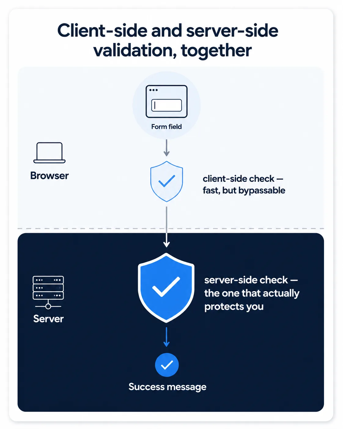
- Visitor types into a field
- JavaScript validates instantly in the browser (Chapter 5) — fast feedback, but can be bypassed
- Form submits to the server
- Server validates again, independently (Chapter 9) — this is the check that actually protects the business
- Only now is the data accepted, stored, and a success message shown
Common Mistakes
- Asking for more fields than genuinely needed at this stage, which measurably increases form abandonment.
- Trusting client-side validation alone — it can always be bypassed by a determined or malicious user.
- Showing generic error messages ("Error") instead of specific ones placed near the field that caused them.
- Leaving a visitor with no confirmation their submission worked, which leads to duplicate submissions or lost leads.
Tools to Use
Form builders (Formspree, Netlify Forms)
Handle form submission and email notification without building a custom backend.
Browser autofill / autocomplete attributes
Reduce friction by letting browsers pre-fill known information.
Honeypot fields
A simple, invisible spam-deterrent field real users never fill in.
A/B testing tools
Compare form completion rates between a 3-field and 5-field version.
Key Takeaways
- Fewer fields generally mean higher completion rates — only ask for what you genuinely need at this stage.
- Always validate on both the client (for instant feedback) and the server (for real security).
- Specific, well-placed error messages reduce frustration and abandonment.
- A clear success message is not optional — users need explicit confirmation their submission worked.
Practical Exercises
- Design a "Get a Quote" form with only three fields: name, phone number, and service needed. Add basic JavaScript validation that prevents submission if any field is empty, and displays a clear success message when all fields are filled in correctly.
Want "Forms and User Input" done for you, not just explained?
We build fast, mobile-first websites for South African local businesses — putting everything in this chapter into practice, professionally.