
Tailwind CSS — Faster Styling
The same ideas as Chapter 3, expressed once you already understand them.
Tailwind CSS is a "utility-first" framework that lets you style elements with small, single-purpose classes directly in your HTML instead of writing custom CSS rules — faster to write, and more consistent because every class pulls from a fixed design system.
Beginner Explanation
Instead of writing custom CSS rules in a separate stylesheet and inventing class names like .hero or .card-title, Tailwind styles elements by applying small, single-purpose utility classes directly in your HTML — classes like p-10 (padding), bg-slate-900 (background colour), or text-4xl (font size). Each class does exactly one job, and you combine many of them to build up a fully styled element. This might sound like a step backward at first — isn’t mixing structure and style exactly what Chapter 3 said to avoid? In practice, Tailwind resolves that tension differently than old-school inline styles: because the utility classes are standardised and constrained to a design system, the result is more consistent, not less.
Spacing classes like p-4 (padding), m-2 (margin), and gap-6 (space between flex/grid items) follow a consistent numeric scale, so p-4 always means the same amount of padding everywhere in your project. Colour classes like bg-slate-900, text-white, or border-pink-500 pull from Tailwind’s built-in colour palette, keeping colours consistent without needing to remember hex codes.
Responsive classes use breakpoint prefixes — sm:, md:, lg:, xl: — to apply different styles at different screen sizes directly inline. For example, text-2xl md:text-4xl means "make this text 2xl-sized normally, but 4xl-sized on medium screens and up," entirely replacing the need to write separate @media blocks by hand. Flex and grid classes (flex, grid, grid-cols-3, items-center, justify-between) apply the same Flexbox and Grid concepts from Chapter 3, just expressed as classes instead of custom CSS rules — and reusable patterns emerge naturally, ready to be wrapped into a single component (Chapter 6) once you’re comfortable with the vocabulary.
The Chapter 2 and 3 plumbing example, rebuilt with Tailwind:
<section class="bg-slate-900 text-white p-10 rounded-xl">
  <h1 class="text-4xl font-bold">Reliable Plumbing Services</h1>
</section>
In one line of classes, this section now has a dark slate background, white text, generous padding, and rounded corners — no separate CSS file required. Beginners appreciate the immediate visual feedback; experts appreciate that it removes an entire category of inconsistency — no more dead CSS rules nobody remembers writing, no more slightly-different shades of blue scattered across a site.
Real Business Examples
Faster first drafts
A mechanic’s landing page goes from blank page to a fully styled hero section in minutes, because every spacing and colour decision is already pre-defined by the utility scale.
Consistent buttons across a whole site
Every "Book Now" button on a salon’s site uses the exact same utility-class combination, so there’s no risk of one page quietly drifting to a slightly different blue.
Responsive without writing a single @media block
text-2xl md:text-4xl on a heading means it’s comfortably sized on a phone and confidently large on desktop — no separate breakpoint file to maintain.
Visual Diagram
Plain CSS vs. Tailwind, side by side
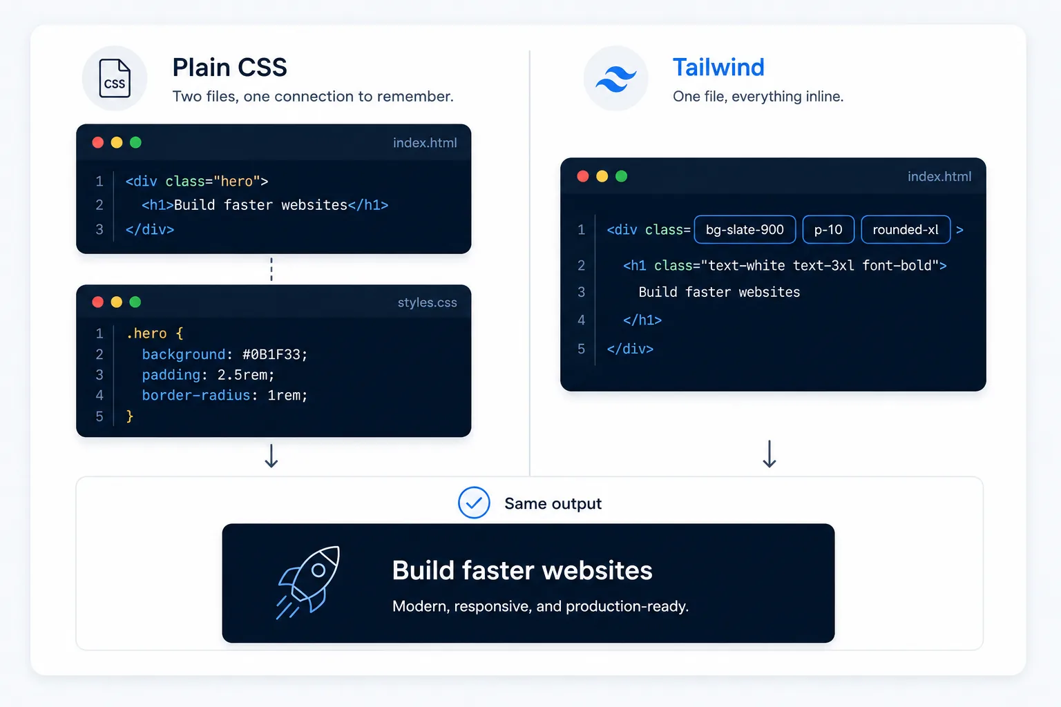
- Plain CSS — write a class name, then a separate rule in a stylesheet: .hero { background: #0b1f33; padding: 80px; }
- Tailwind — apply ready-made utility classes straight in the HTML: class="bg-slate-900 p-10"
- Both approaches produce the same visual result — Tailwind just skips the "invent a class name, then define it elsewhere" step
Common Mistakes
- Assuming Tailwind replaces the need to understand CSS — it assumes that understanding; the clearer your grasp of Chapter 3, the faster Tailwind feels.
- Fighting the design system by constantly reaching for arbitrary values instead of the built-in spacing and colour scale, which erodes the consistency Tailwind is meant to provide.
- Letting class lists grow unreadably long on a single element without ever extracting a repeated pattern into a component (Chapter 6).
Tools to Use
Tailwind CSS
The framework itself — utility classes for spacing, colour, typography, and layout.
Tailwind Play
An in-browser sandbox for experimenting with utility classes with zero setup.
Tailwind IntelliSense (VS Code extension)
Autocompletes class names and previews their effect as you type.
Headless UI / shadcn
Pre-built, accessible interactive components styled to work naturally with Tailwind.
Key Takeaways
- Tailwind is utility-first: you compose styles from small, single-purpose classes directly in your HTML.
- Because utility classes pull from a constrained design system, Tailwind tends to produce more visual consistency than free-form custom CSS, not less.
- Responsive design is built into class names (md:, lg:) instead of written as separate media query blocks.
- Tailwind speeds up development but still relies on a solid understanding of the underlying CSS concepts from Chapter 3.
Practical Exercises
- Rebuild the page from Chapter 3 using only Tailwind utility classes — no custom CSS file at all. Use responsive prefixes (md:, lg:) to make the main heading larger on bigger screens, and use flex utilities to lay out the navigation bar.
Want "Tailwind CSS — Faster Styling" done for you, not just explained?
We build fast, mobile-first websites for South African local businesses — putting everything in this chapter into practice, professionally.