
CSS — The Visual Design
HTML gives a page its bones; CSS gives it a face.
CSS (Cascading Style Sheets) controls every visual and layout decision on a website — colours, fonts, spacing, positioning, and how a page reflows across different screen sizes.
Beginner Explanation
Colours are set using properties like color (text) and background (backgrounds), using formats such as named colours, hex codes (#0b1f33), RGB, or HSL. Professional designers typically work from a defined colour palette (usually 2–4 core colours plus neutrals) rather than picking colours ad hoc, which is what gives a finished site visual consistency. Fonts are controlled with font-family, font-size, font-weight, and line-height, always specifying a fallback font stack in case a custom web font fails to load.
Spacing is handled through margin (space outside an element) and padding (space inside an element, between its border and its content). Confusing these two is one of the most common beginner mistakes — a good mental model is that padding pushes content inward from an element’s own edges, while margin pushes other elements away from it. Borders and shadows add definition and depth; a subtle box-shadow is one of the simplest ways to make a flat design feel more three-dimensional and "premium."
Flexbox (display: flex) is a one-dimensional layout system, ideal for arranging items in a row or a column. Grid (display: grid) is a two-dimensional layout system, ideal for arranging content into rows and columns simultaneously. As a rule of thumb: reach for Flexbox when aligning items along a single line, and reach for Grid when arranging content into a true grid. Media queries (@media (max-width: 768px) {...}) let you apply different CSS rules depending on screen size — a professional, "mobile-first" workflow writes base styles for small screens first, then layers on complexity for larger screens.
The framework’s plain-CSS example — a dark, breathing-room-rich hero banner:
.hero {
  background: #0b1f33;
  color: white;
  padding: 80px 24px;
}
This single rule targets any element with the class hero and gives it a dark navy background, white text, and generous internal spacing — instantly turning a plain block of HTML into a deliberate "hero" banner, the kind of large introductory section you see at the top of most modern websites.
Real Business Examples
A dark hero banner
The .hero rule above turns a plain block of HTML into the kind of banner you see at the top of most modern business sites — dark background, generous padding, confident type.
Mobile-first navigation
A restaurant’s nav bar uses Flexbox to sit in a row on desktop, then a media query stacks it vertically under 600px so it’s still usable on a phone.
A defined colour palette
A cleaning company picks one navy, one sky-blue accent, and one neutral grey — then uses only those three, everywhere, so every page looks like it belongs to the same brand.
Visual Diagram
Padding vs. margin
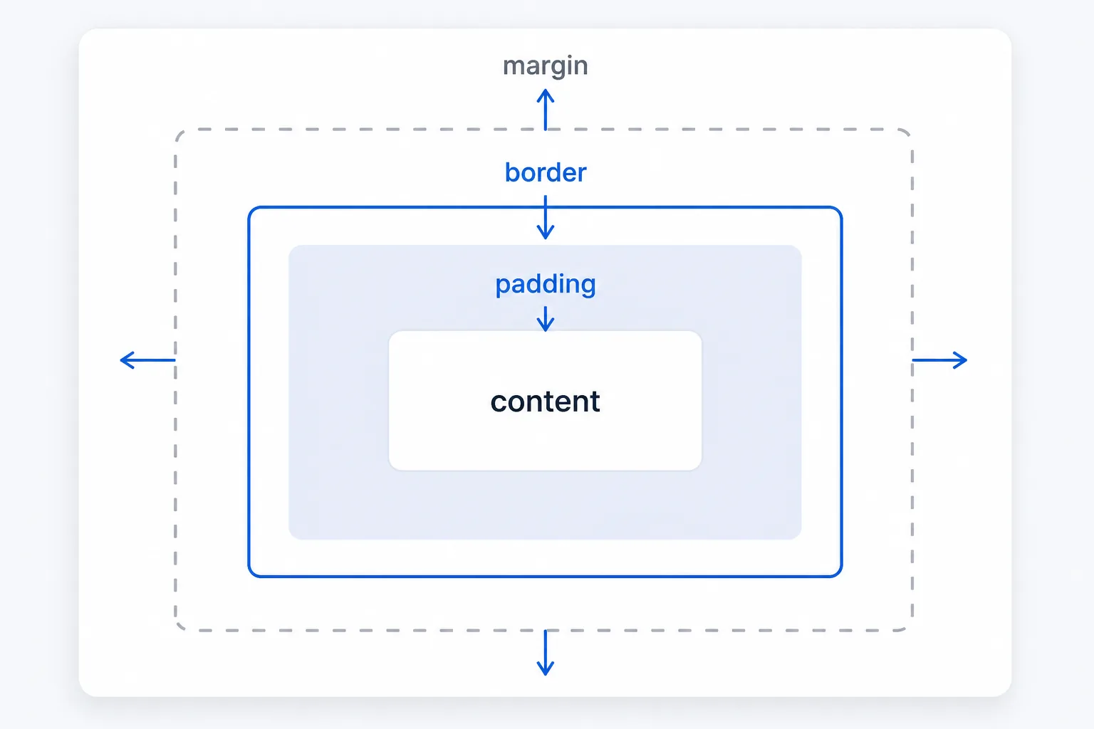
- Element border — the edge of the box
- padding — space INSIDE the border, between border and content
- content — the text or image itself
- (outside the border) margin — space OUTSIDE the border, pushing other elements away
Common Mistakes
- Confusing padding (inside spacing) with margin (outside spacing).
- Designing desktop-first and bolting on mobile styles afterward, instead of writing mobile-first base styles and layering complexity on for larger screens.
- Reaching for Grid when Flexbox would do (or vice versa) — Flexbox for one-dimensional rows/columns, Grid for true two-dimensional layouts.
- Overusing animation — it should add polish and guide attention, not distract or harm accessibility for motion-sensitive users.
Tools to Use
Google Fonts
Free custom web fonts to match a brand’s identity, always with a fallback font stack.
Browser DevTools (Elements panel)
Live-edit CSS in the browser to experiment before committing changes to a file.
Coolors / Adobe Color
Build a defined 2–4 colour palette instead of picking colours ad hoc.
CSS Grid / Flexbox cheat sheets
Quick visual references for choosing and writing the right layout properties.
Key Takeaways
- CSS controls appearance and layout; HTML controls meaning and structure — keeping them separate keeps projects maintainable.
- Padding adds space inside an element; margin adds space outside it.
- Flexbox is for one-dimensional alignment (rows or columns); Grid is for two-dimensional layouts (rows and columns together).
- Media queries make responsive design possible — always design mobile-first.
Practical Exercises
- Take the semantic HTML page from Chapter 2 and style it with plain CSS: give it a colour palette (2–3 colours), style the navigation with Flexbox, and add a media query that stacks the navigation vertically below 600px.
Want "CSS — The Visual Design" done for you, not just explained?
We build fast, mobile-first websites for South African local businesses — putting everything in this chapter into practice, professionally.